Nexus

Product goal
Target Audience
Individual Role
Problem statement


Breaking down the design process
quantitive research
Conducted desktop research to understand the sector and how it challenges industry norms. Findings highlighted the benefits SMEs experience using virtual assistants and revealed increased advantages for larger companies.

Competitive audit
Analysed competitors to identify opportunities and integrate them into the design. The audit considered website comparisons and branding integration throughout the product.

PERSONAs

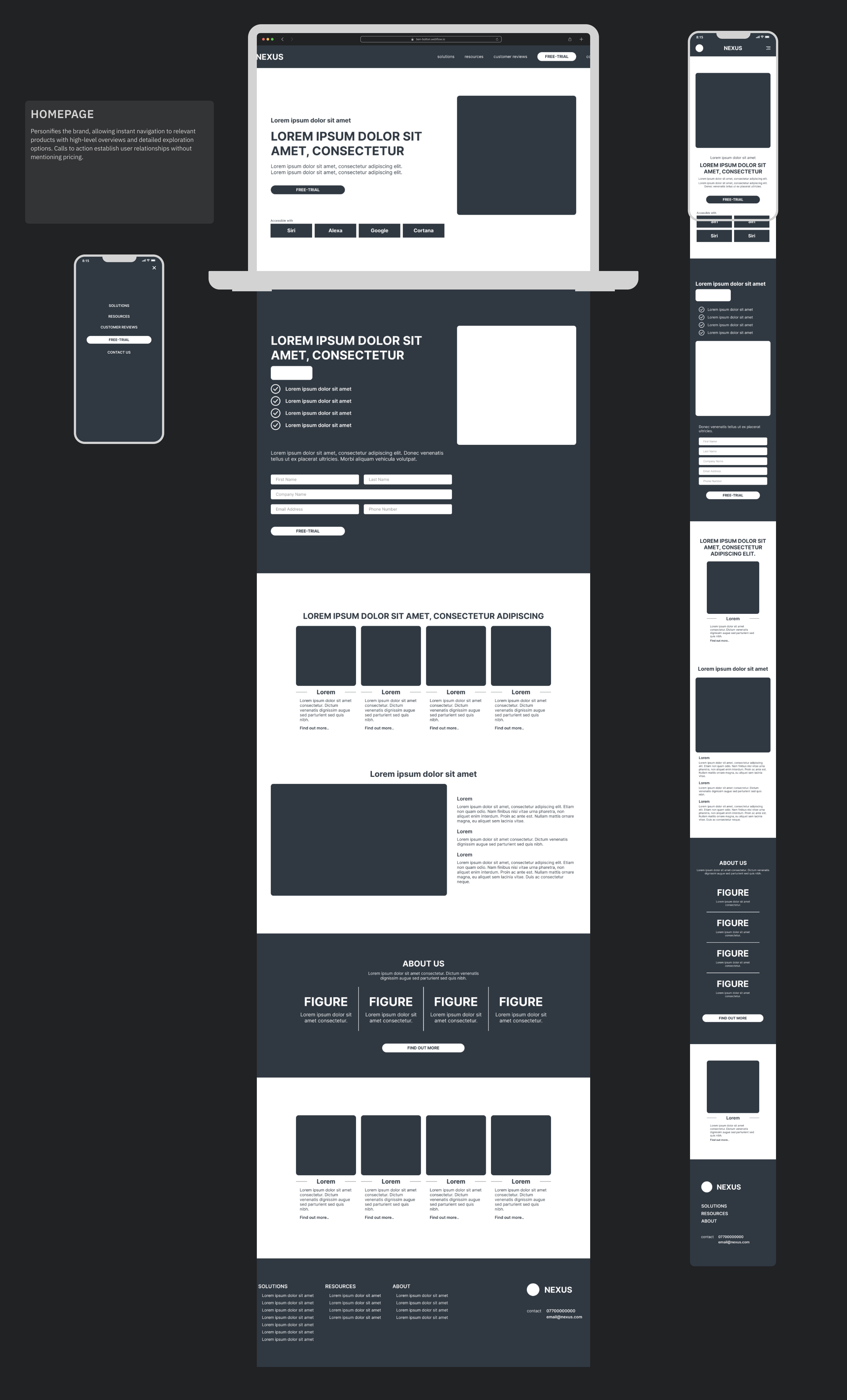
Information Architecture
Following a top-down approach, the site map illustrates the user journey from interest to subscription. The product aims to attract users to subscribe or enquire through call-to-action points, with additional information designed to convert sales.

Wireframing
Initial sketches secured stakeholder feedback and client buy-in, focusing on integrating brand identity and creating a strong user experience. The design progressed into low-fidelity prototypes to understand user flow and connections between supporting elements and the primary flow.


Research Overview
Conducted two remote unmoderated usability studies. Users completed prompts to identify pain points and test the primary user flow. Effectiveness was measured by completion rates and times. The first study used a low-fidelity prototype; the second focused on specific CTA engagement with a high-fidelity prototype.
Insight 1
Insight 2
Insight 3
Style guide


Lessons Learnt
This project challenged my skills, allowing experimentation and interpretation of the brief, starting from a blank canvas to design the company's brand identity and website. It further fuelled my passion for product design, adapting my process to develop website design and branding in tandem for a coherent digital product.
