SEVolution

Project overview
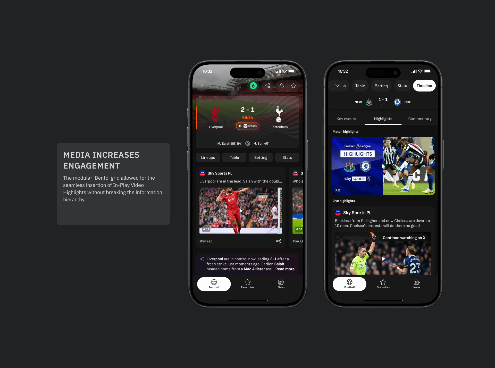
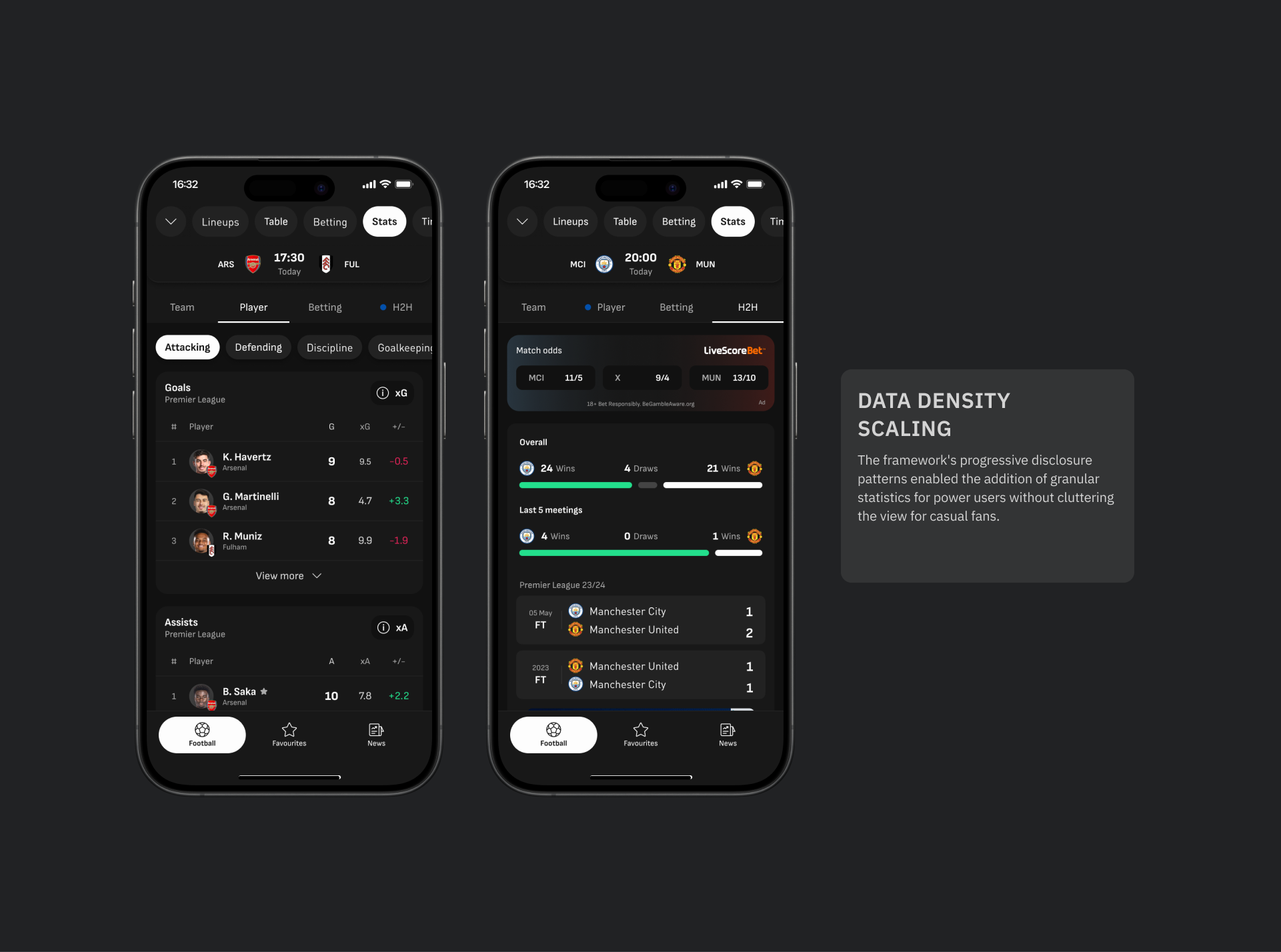
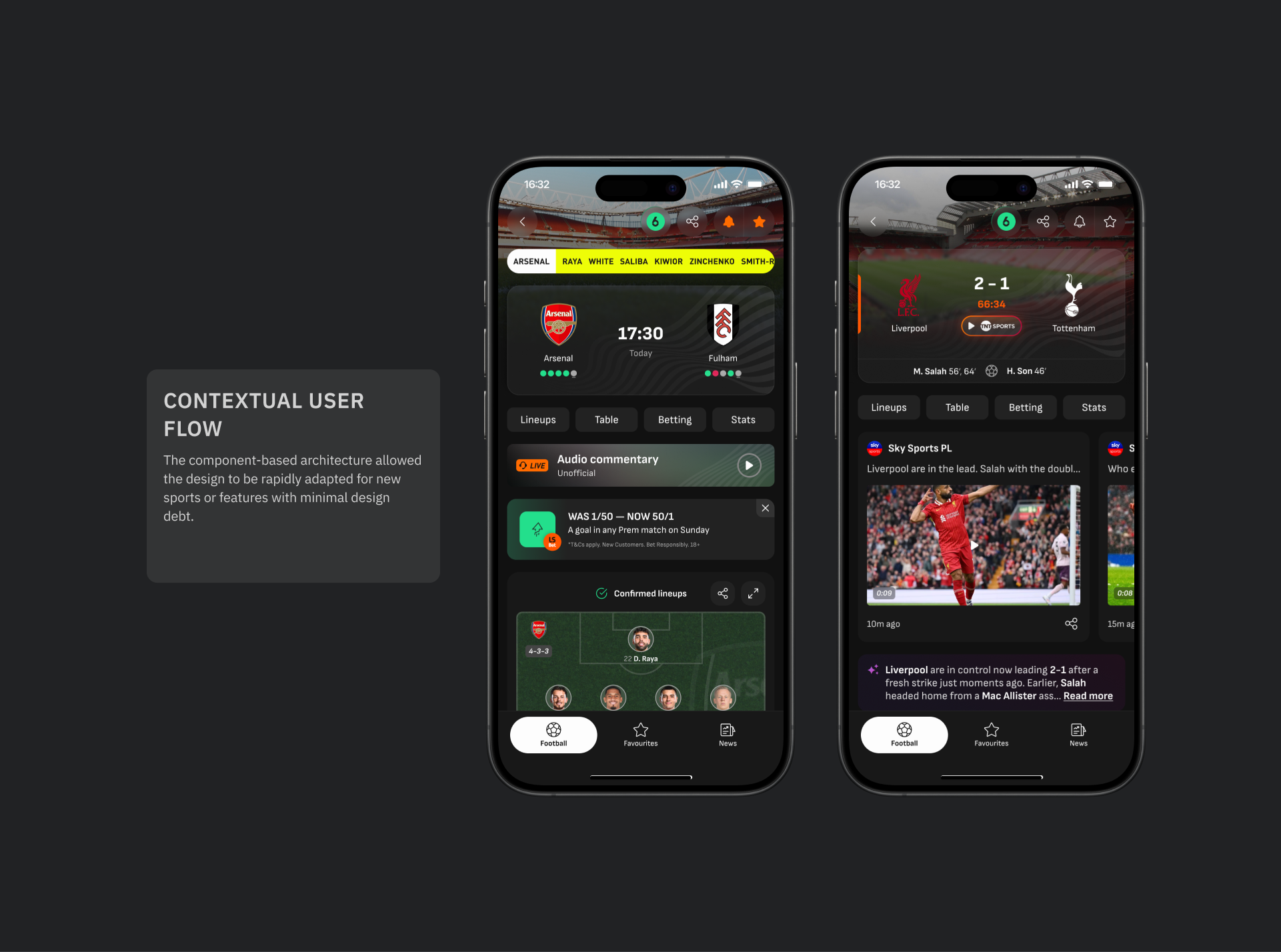
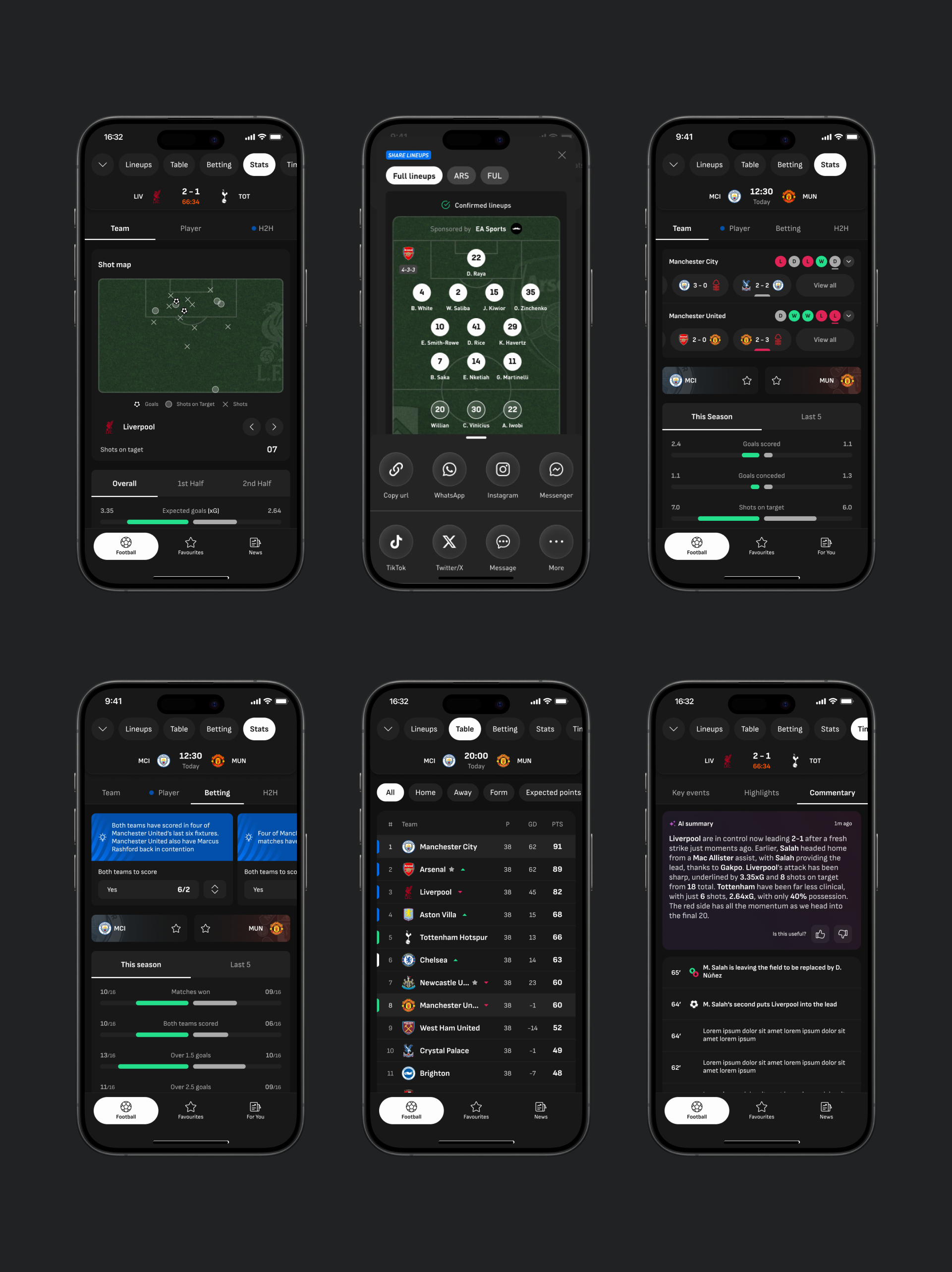
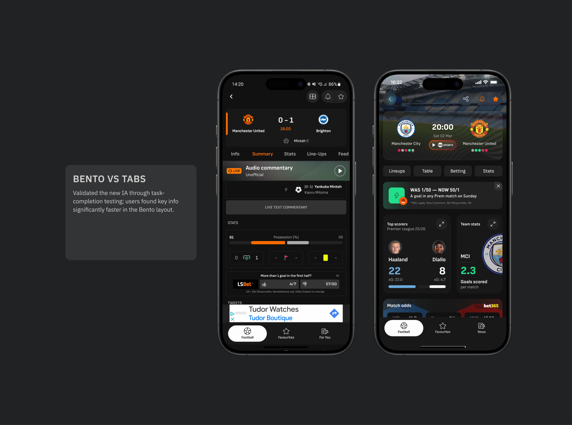
A strategic redesign of the Single Event View (SEV), transforming a static data table into a dynamic, narrative-led experience. This overhaul established the modular ‘Bento’ framework that enables future-proofing with additional features introduced.
The context
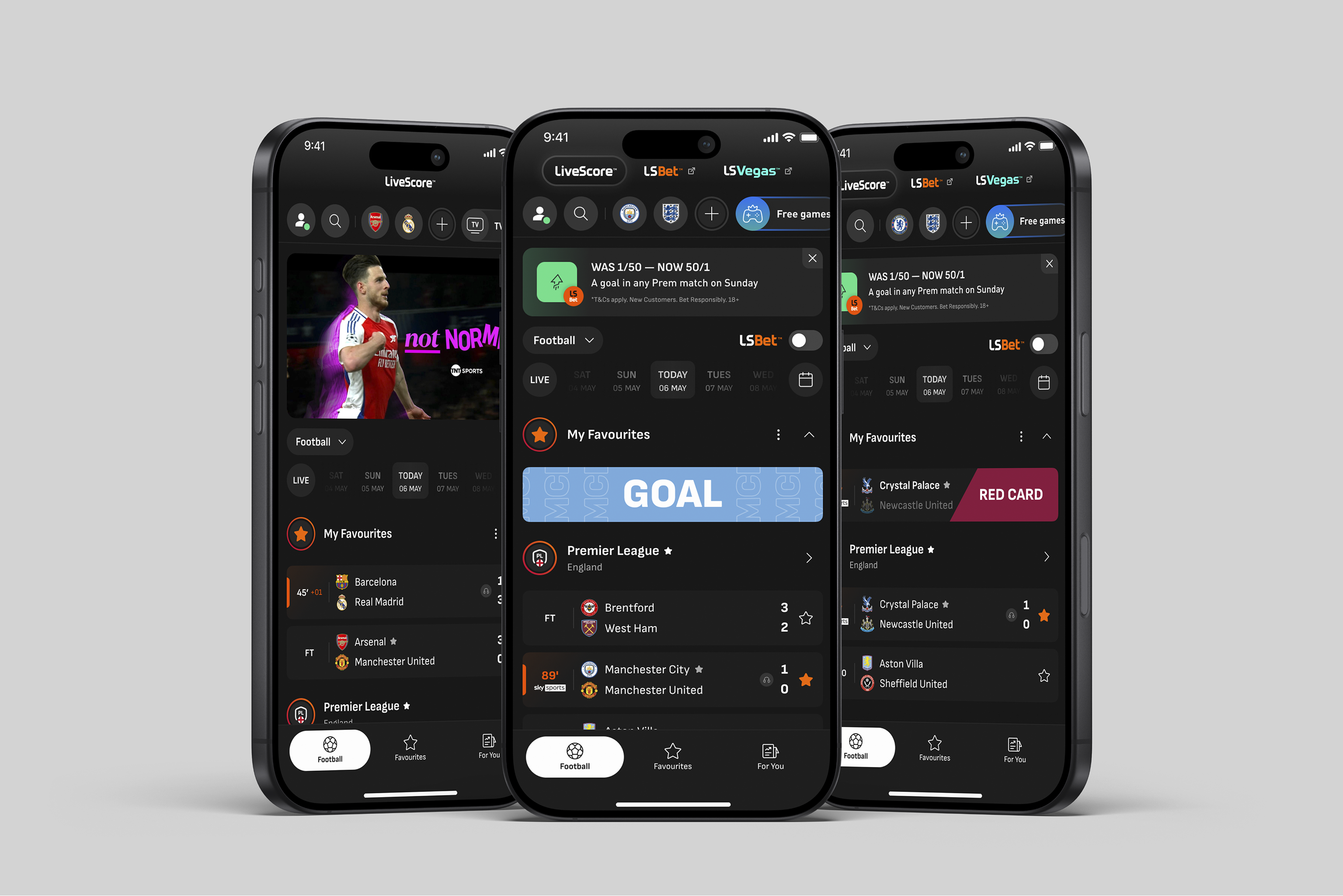
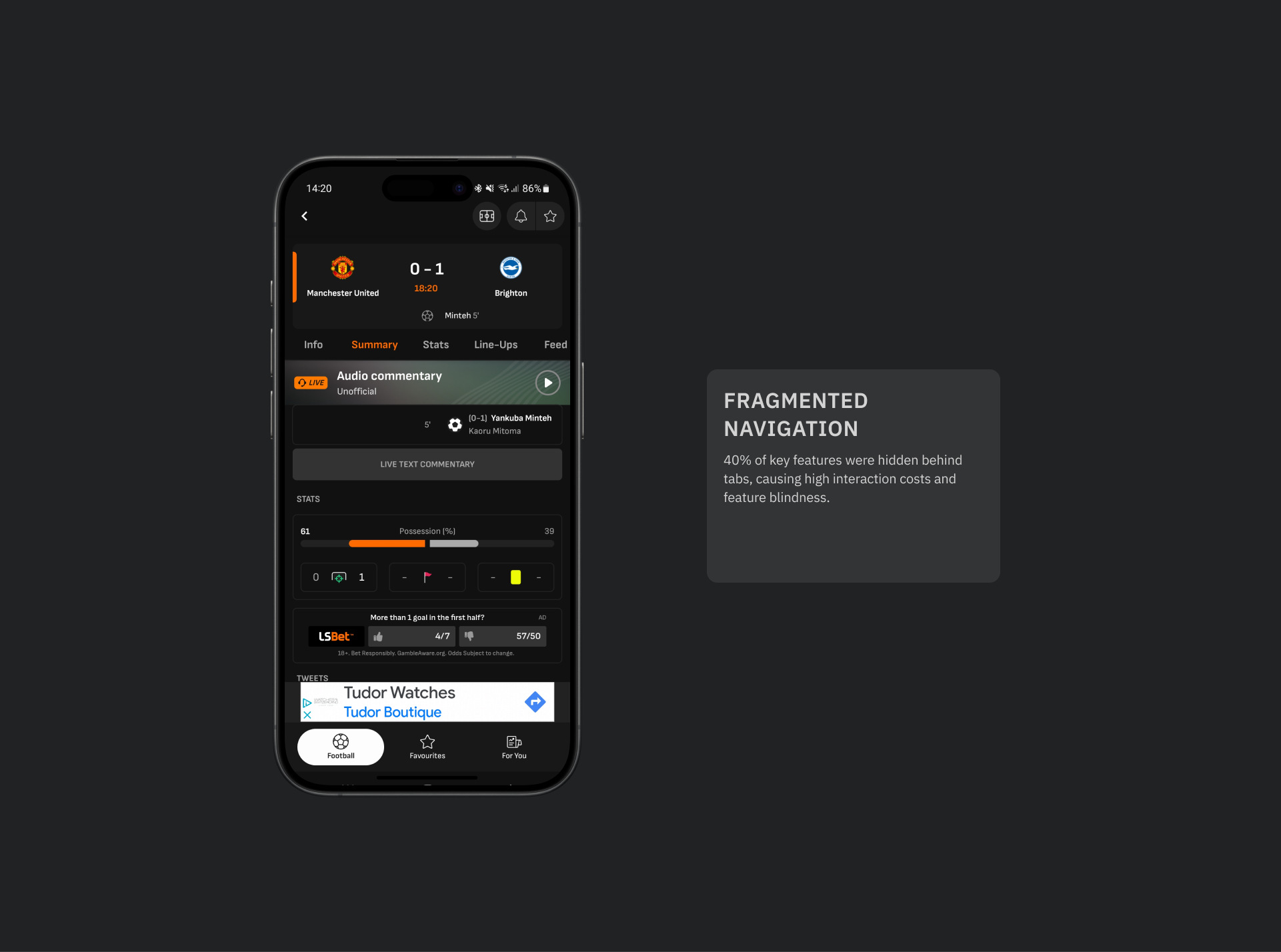
LiveScore had a massive audience, but a passive interface that suffered from the ‘one more tab’ approach. The approach caused cognitive overload and failed to funnel high-intent users toward betting actions, resulting in missed opportunities.
Key Metics
170%
Increased in Betting traffic, achieved in the first 3 months by integrating active intent user flows.
15%
Engagement uplift, driven by the shift to a narrative-led timeline.
18%
Increase in satisfaction. validated through user sentiment scores post-launch.
The solution
No items found.
PROCESS AND STRATEGY
Responsibility
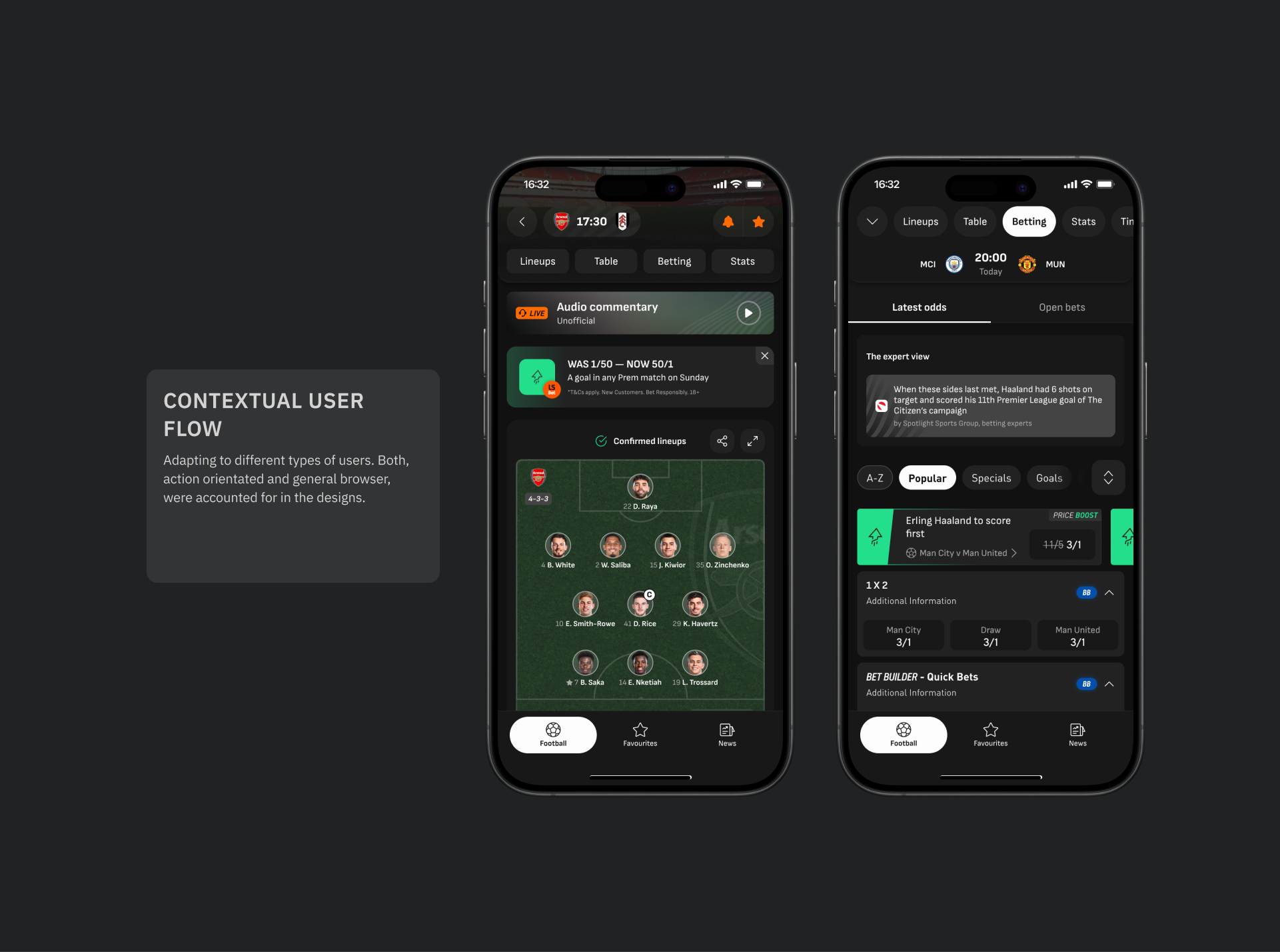
I managed the end to end process, from user research and strategy to high-fidelity prototyping and QA.
Research-led
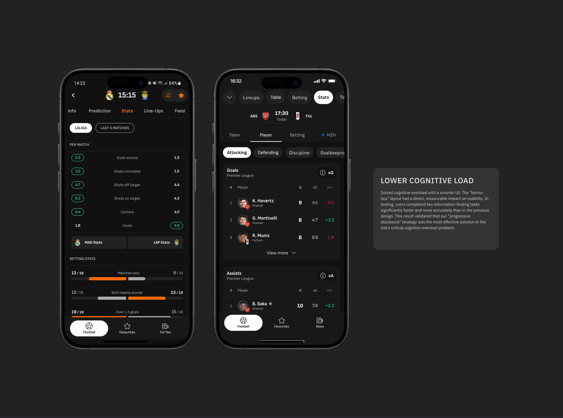
Used quantitative testing to validate the "Clarity over Depth" hypothesis, defending the removal of immediate granular stats.
Stakeholder alignment
Utilised video evidence from user sessions to resolve internal conflicts between Betting and Editorial teams regarding feature prominence.
Problems identified
No items found.
Research insights
Insight
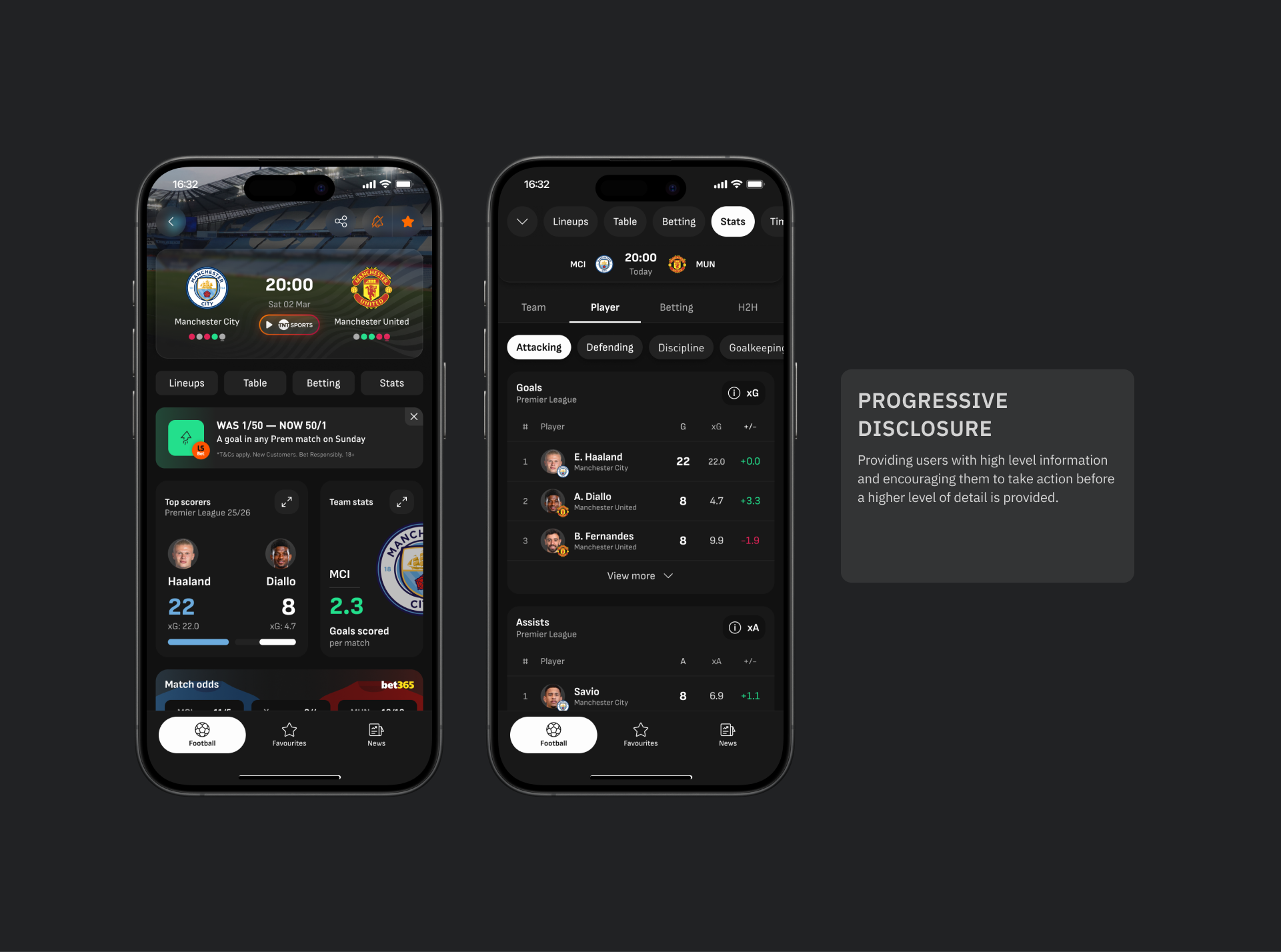
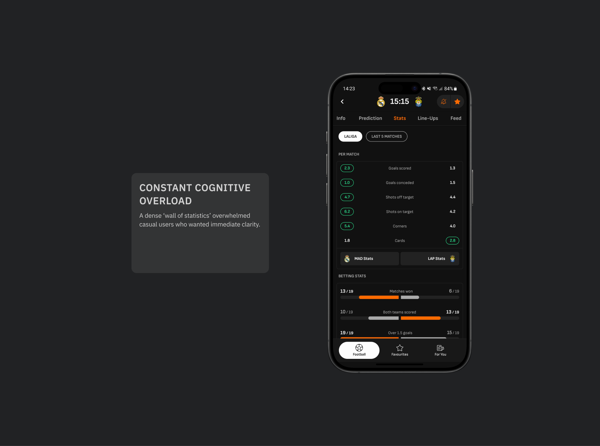
Users were overwhelmed by volume; they needed a summary view before diving into deep stats.
Insight
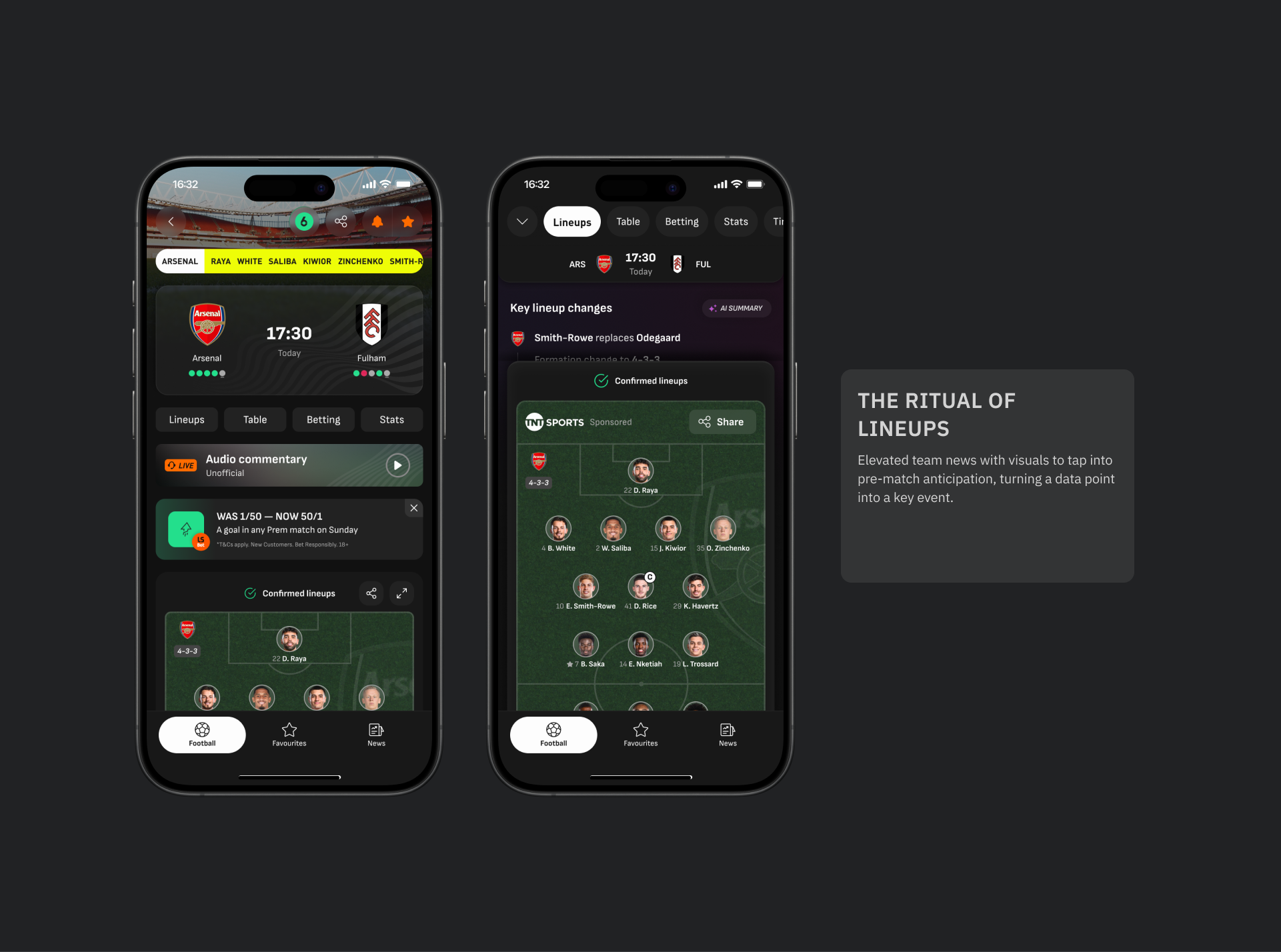
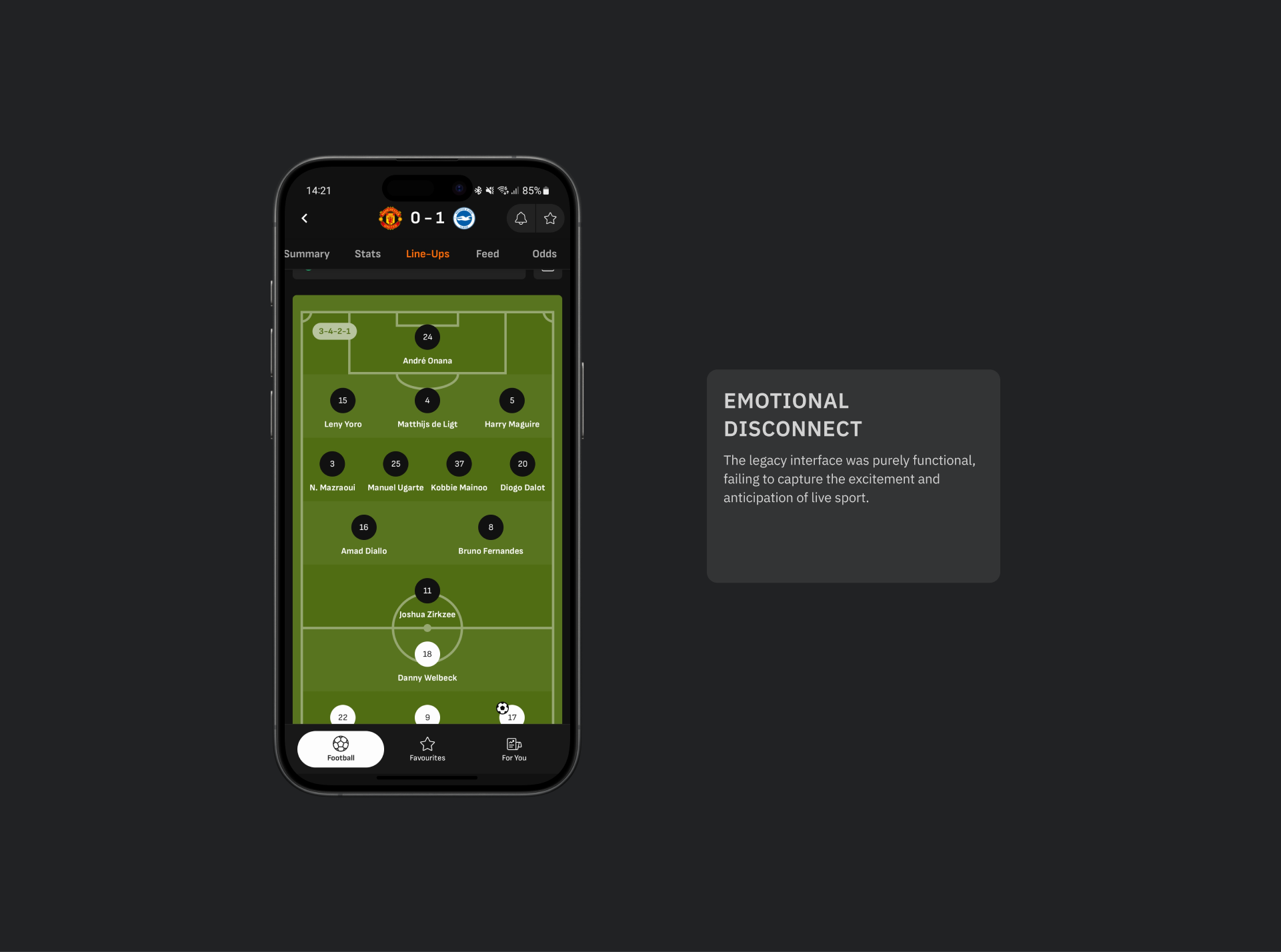
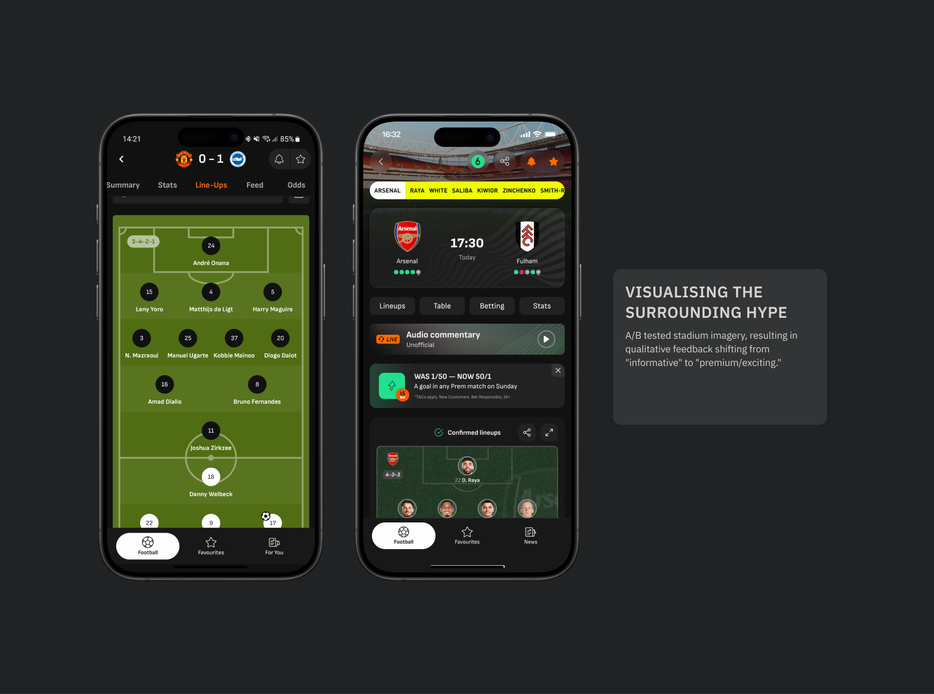
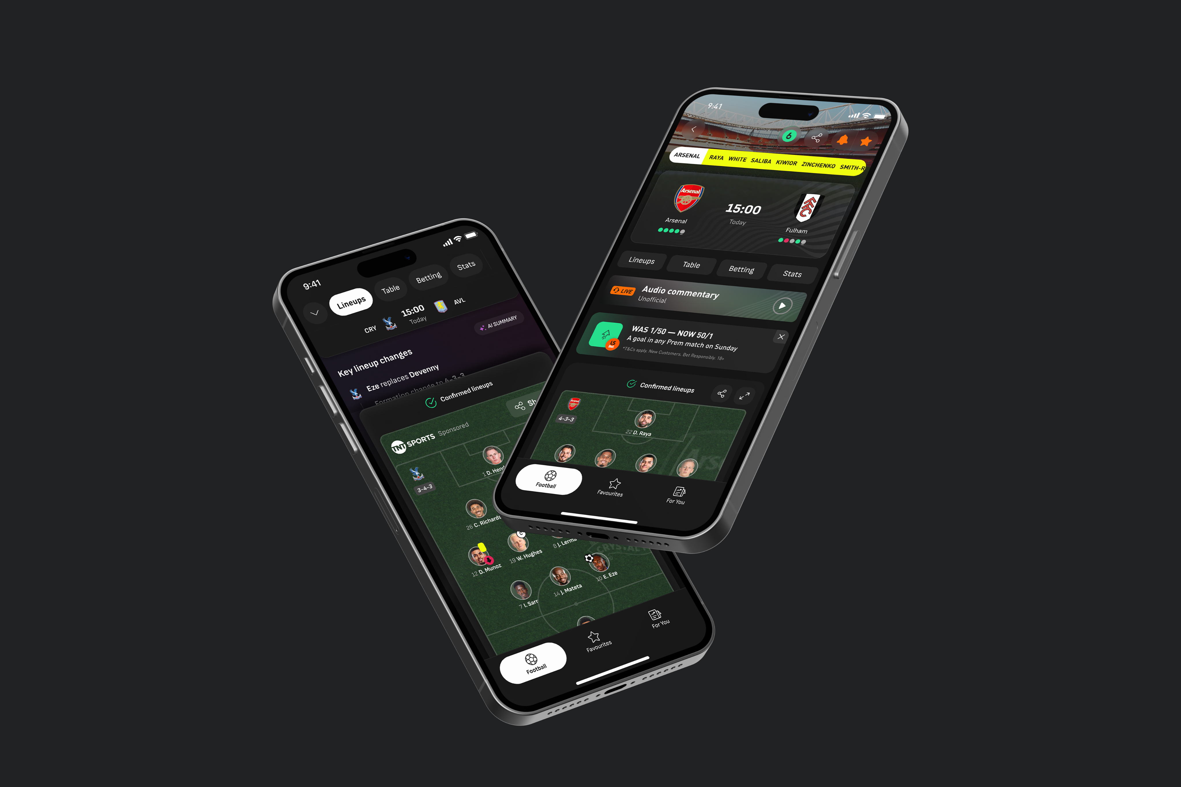
Fans view checking lineups as an emotional pre-match event, not just a data check.
Insight
Users perceive a match as a narrative arc (goals, cards, drama), not a static spreadsheet.
Experimentation
No items found.
Lessons learnt
Engineering Co-Creator
Involving lead engineers in the wireframing phase identified technical constraints early, reducing dev churn.
Data as Negotiation
Anchoring subjective design debates in objective user data is the most effective way to align conflicting stakeholders.
Systems vs. Pages
Designing flexible frameworks (systems) delivers significantly higher long-term value than designing perfect static pages.