The Up Co

Project overview
Business opportunity
Role & ownership
Outcome
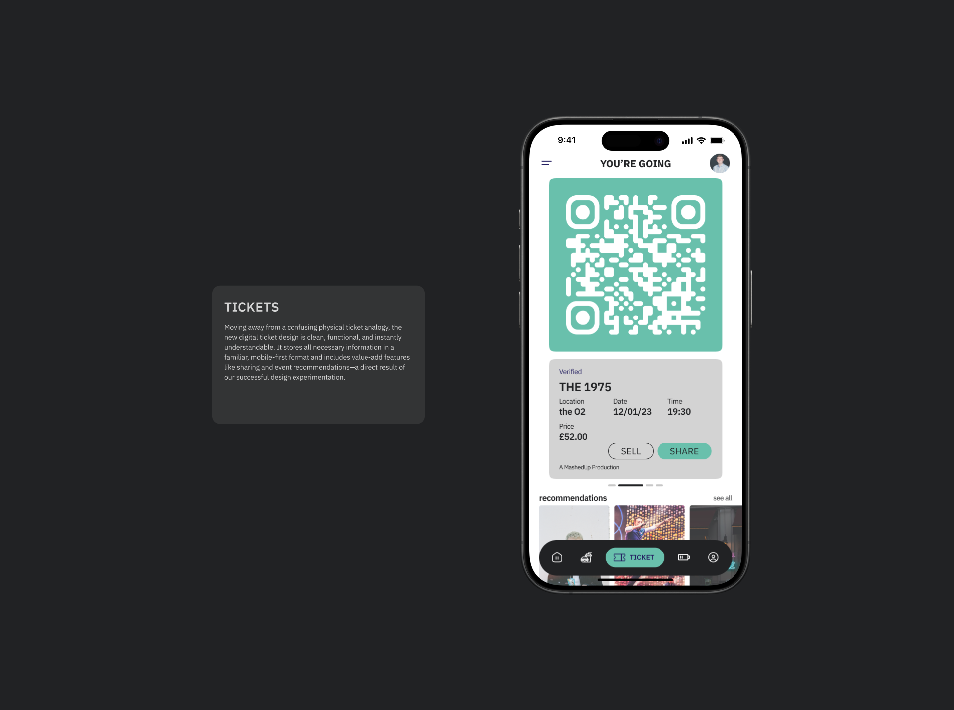
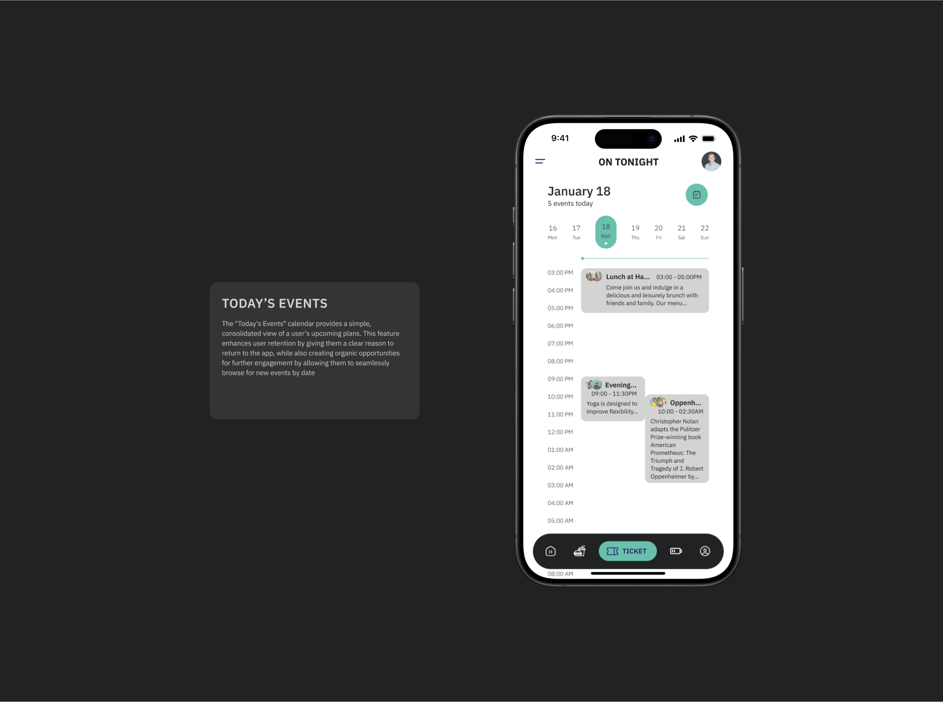
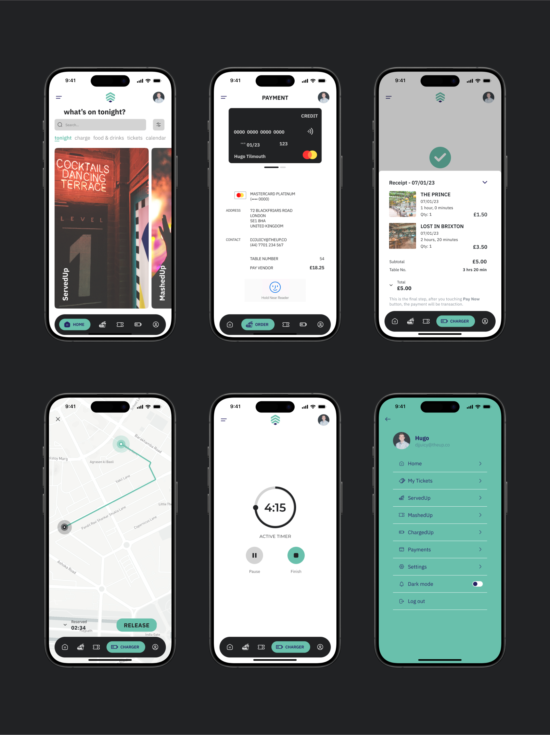
Final Designs

design process breakdown
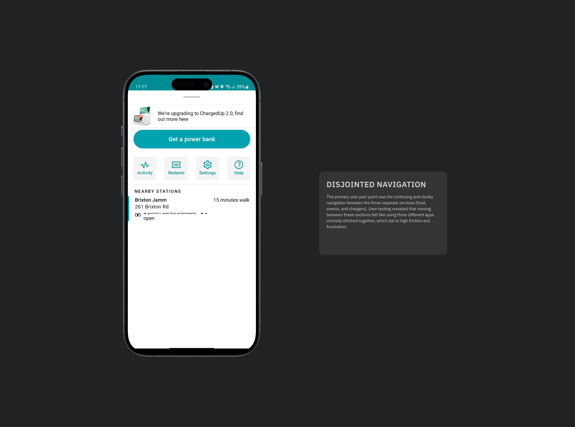
Competitive Audit
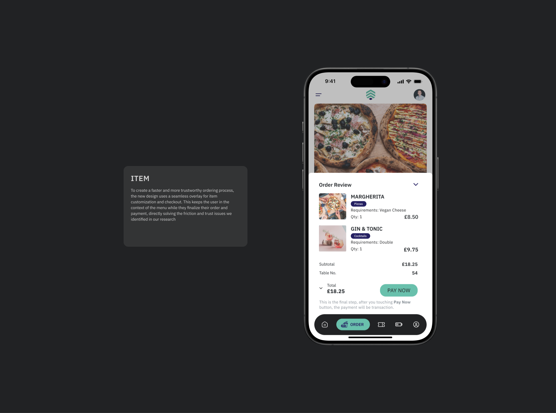
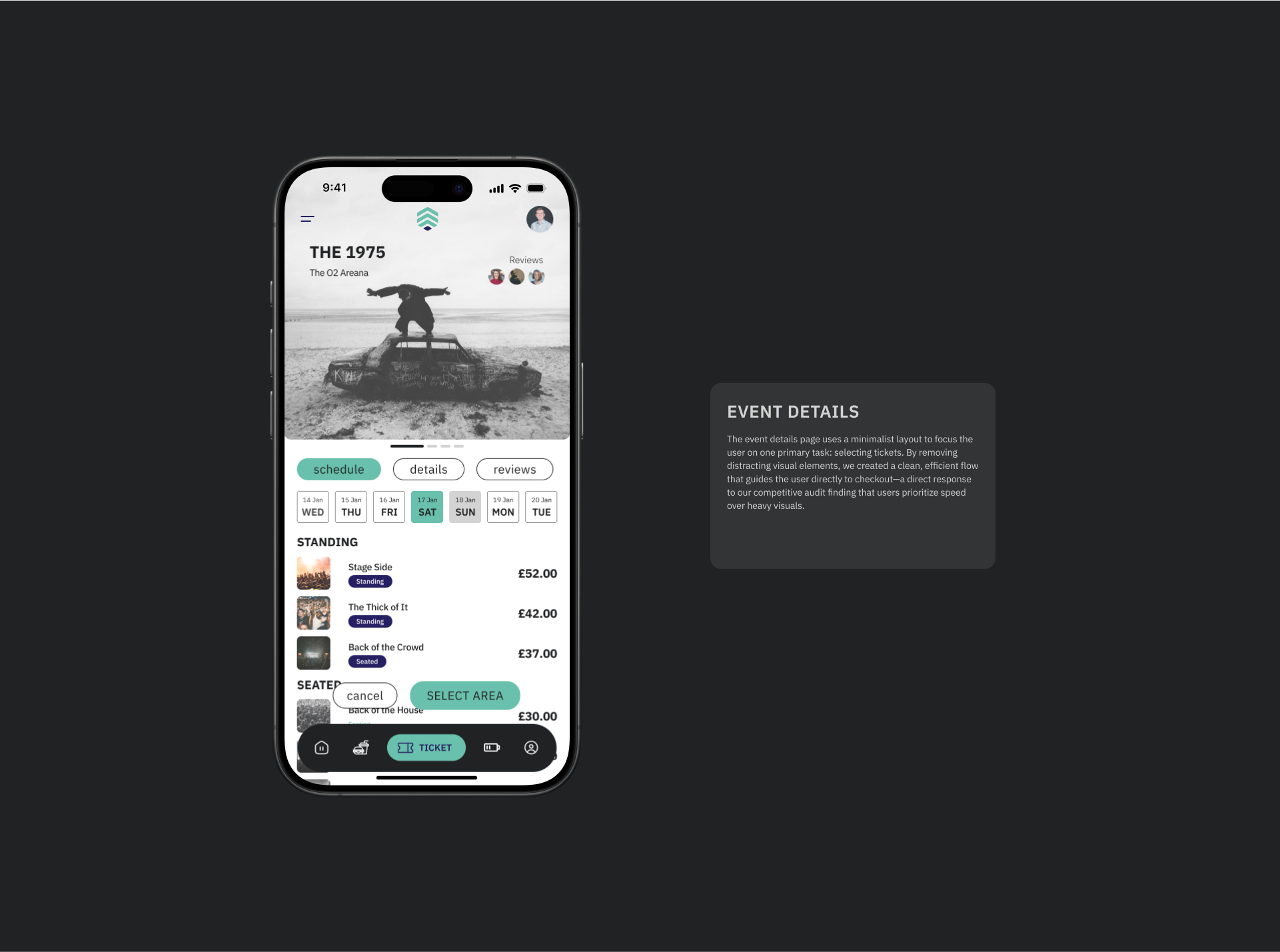
Create a truly unified experience: The most significant opportunity was to integrate three distinct services—food ordering (ServedUp), event ticketing (MashedUp), and charger rentals (ChargedUp)—into a single, cohesive application. This would provide a powerful market differentiator and a far more convenient experience for users.
Insight 1
Insight 2
Insight 3
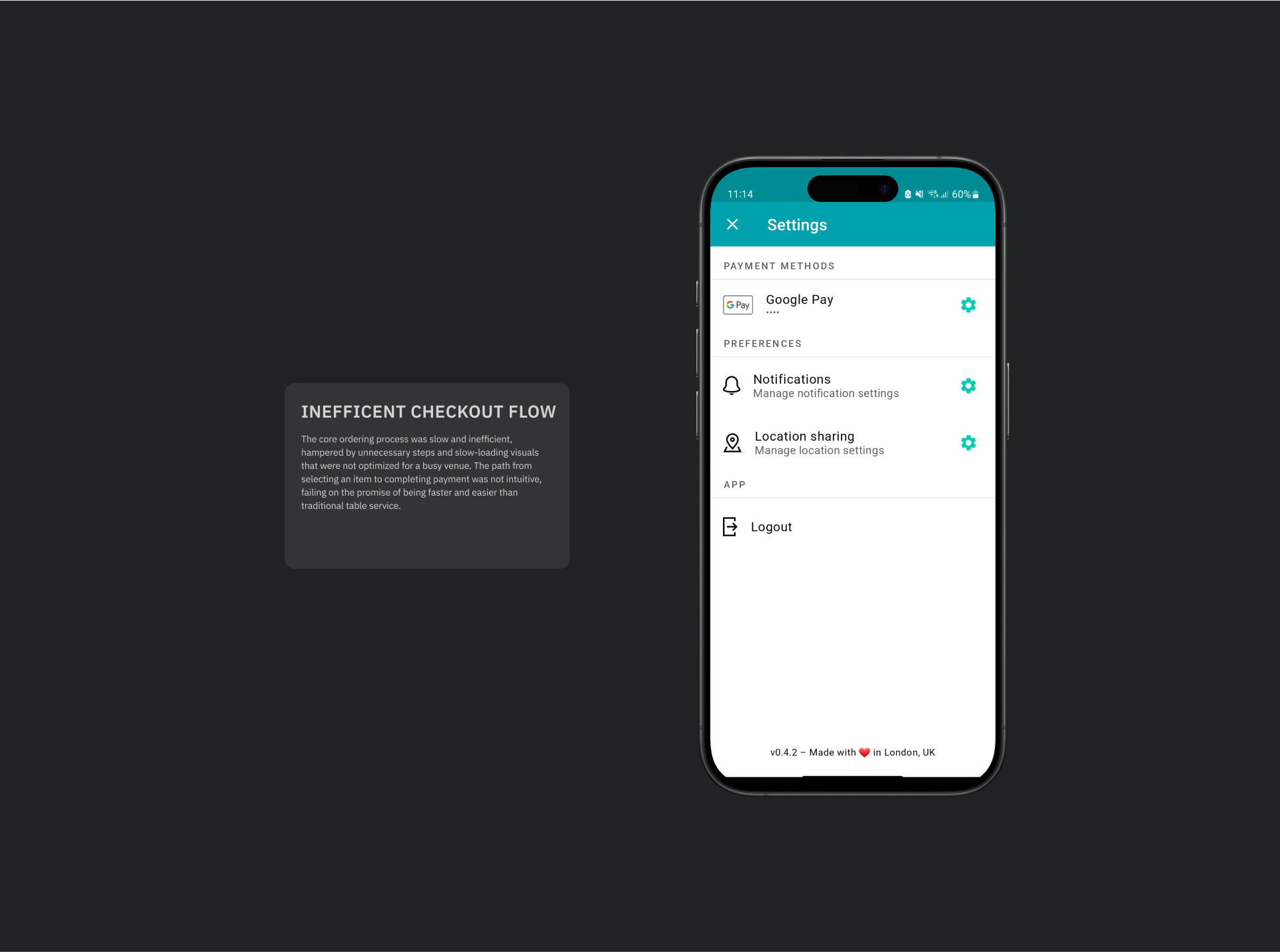
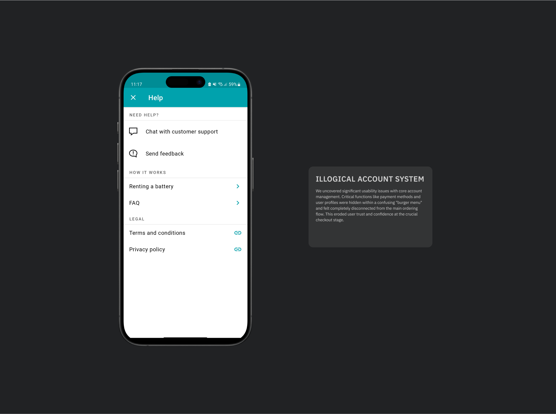
Problems Identified
Wireframing
My goal during wireframing was to solve the core challenge of unifying three distinct services into a single, intuitive application. I began with rapid sketching to explore different ways of integrating the food, events, and charger rental services, focusing on identifying shared UI patterns and overlaps that could create a consistent user experience. This achieved stakeholder alignment on a unified structural approach. From these foundational sketches, I developed low-fidelity prototypes specifically designed to test our proposed solution for the disjointed navigation and to validate a more streamlined, efficient ordering flow with real users.


Research Overview
To validate our new, unified design, I conducted a series of remote unmoderated usability studies using the low-fidelity prototype. The primary goal was to test whether our proposed solution successfully solved the key navigation and ordering problems we had previously identified. The feedback was essential for refining the design before moving to high-fidelity.
Insight 1
Insight 2
Insight 3
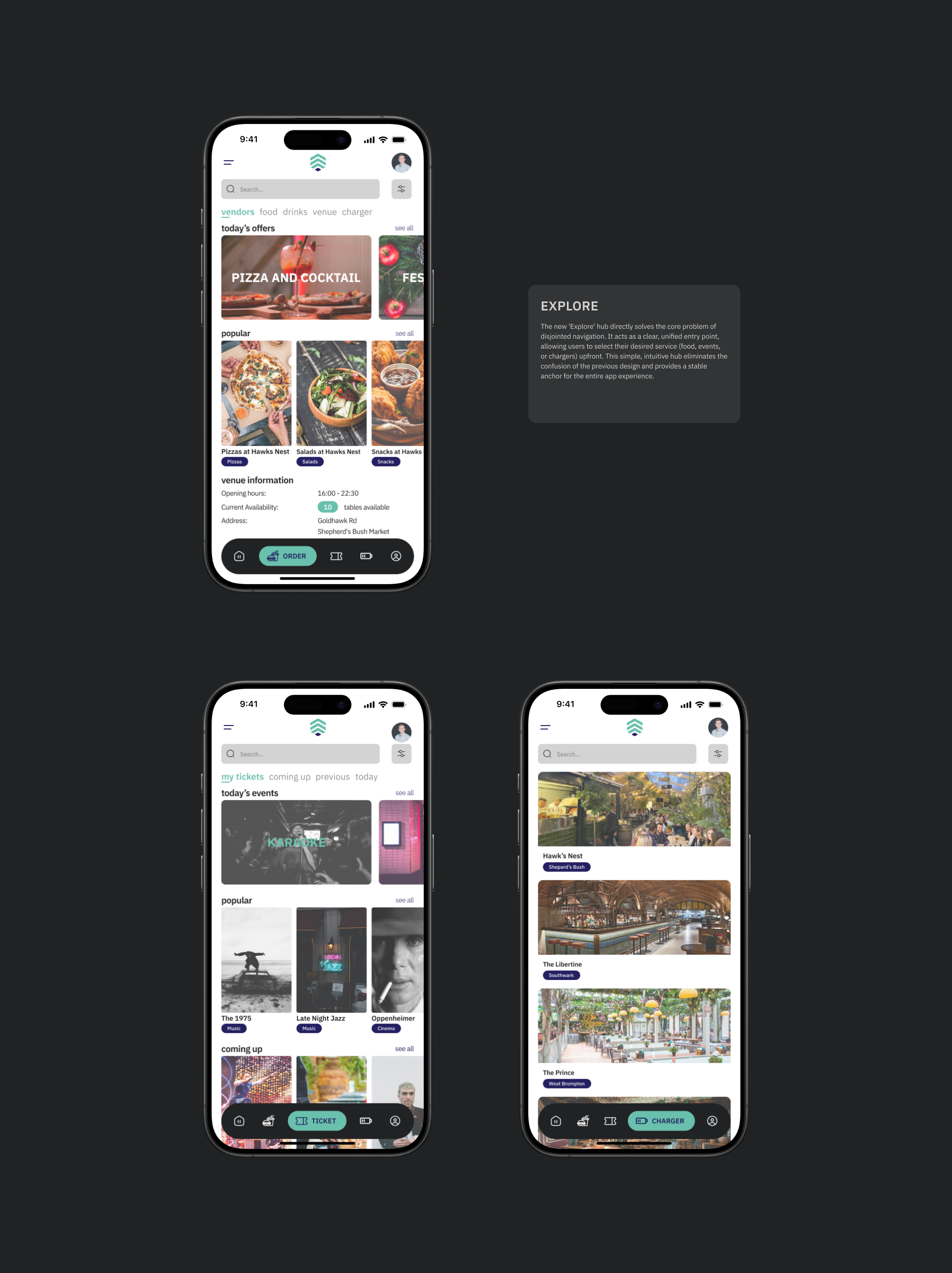
Information Architecture
The information architecture was redesigned with one primary goal: to solve the fragmented navigation discovered in the research. By adopting a mobile-first, "unified entry" model that fundamentally restructured the user's journey. Instead of three siloed applications, the new IA presents users with a clear choice of service upfront. Before guiding them down a specific, task-oriented flow. This structure ensures users are always aware of where they are in the app and provides a consistent framework that makes navigating between the different services intuitive and predictable, directly solving the core usability issues of the previous design.

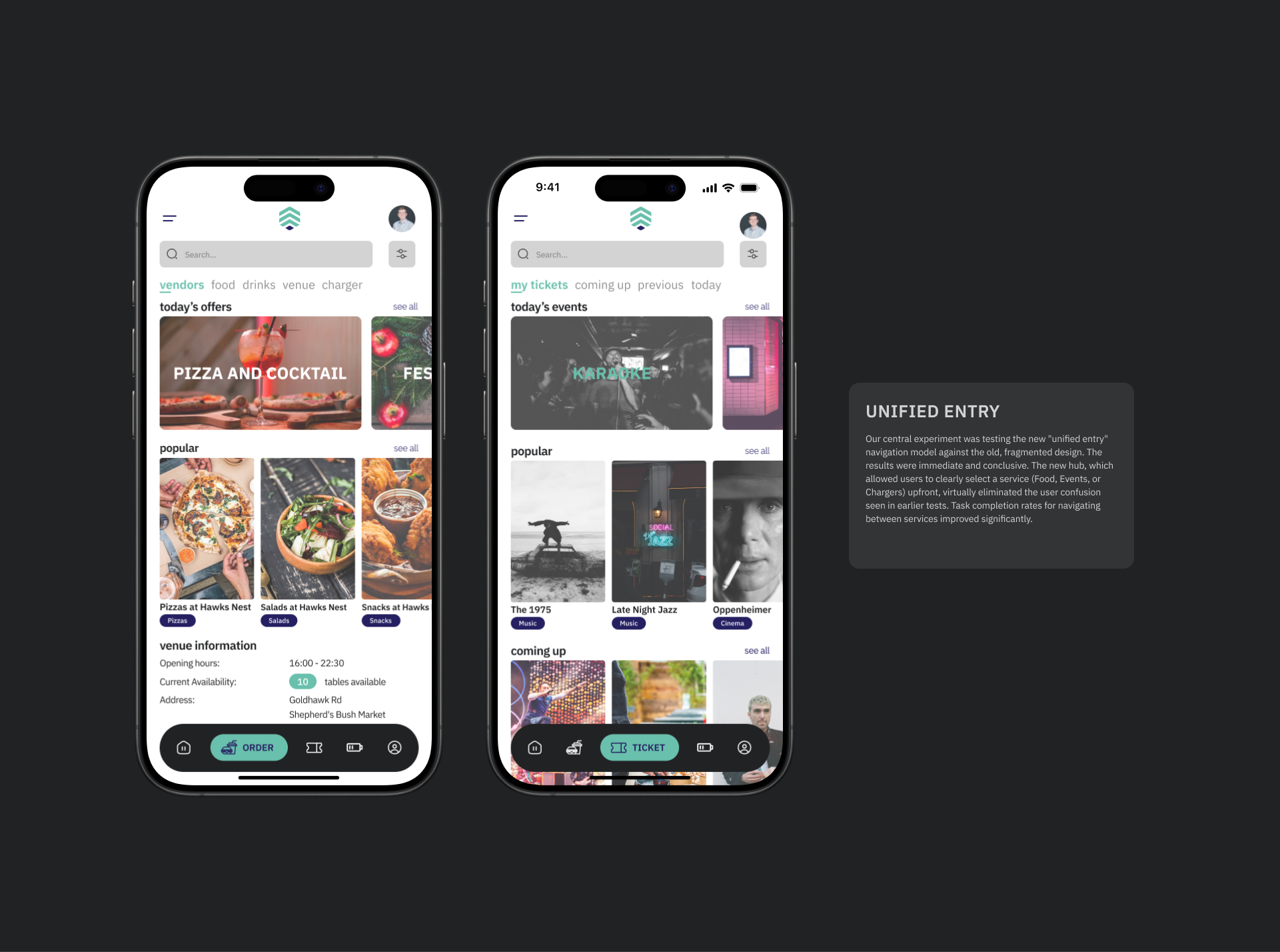
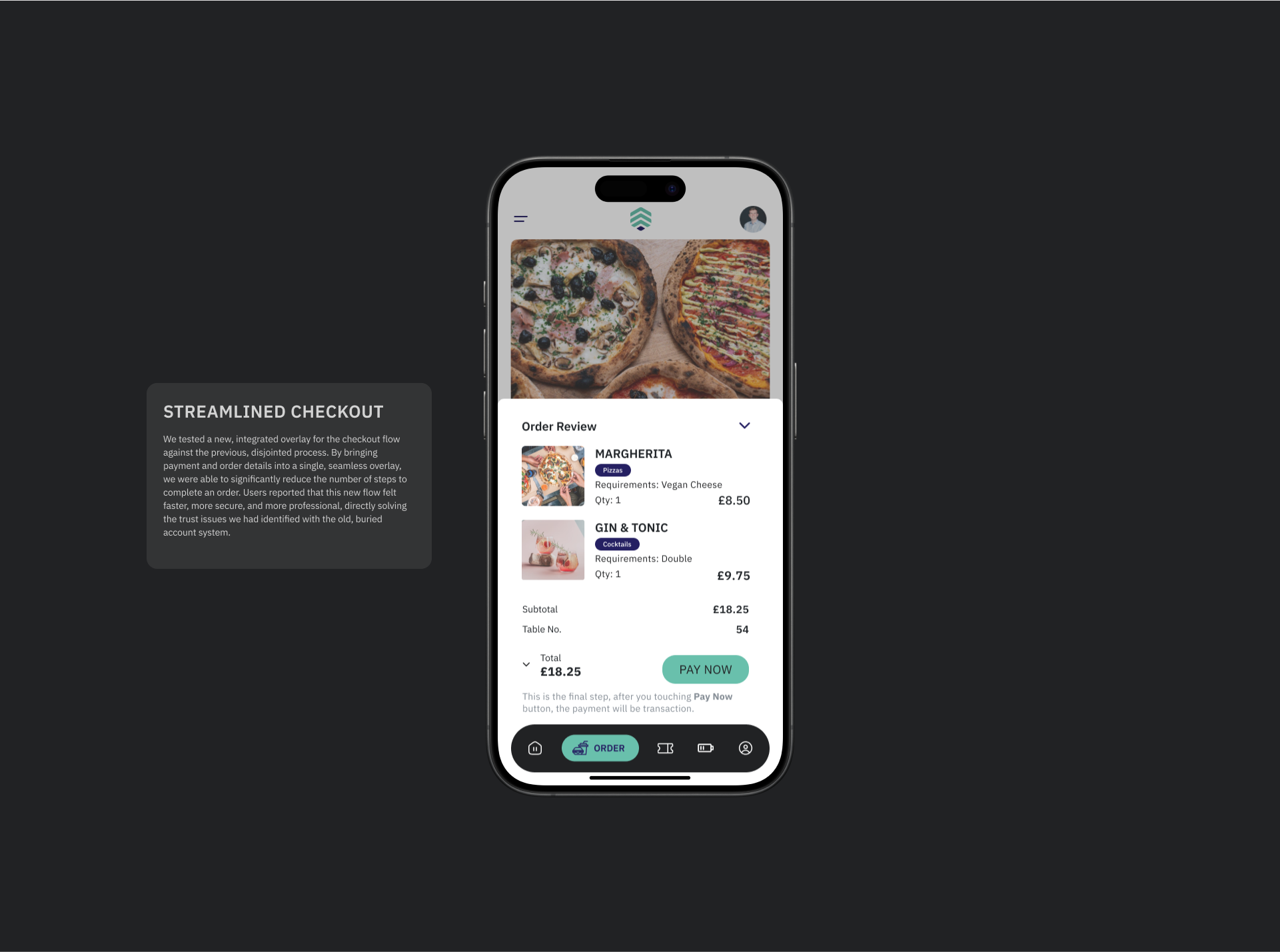
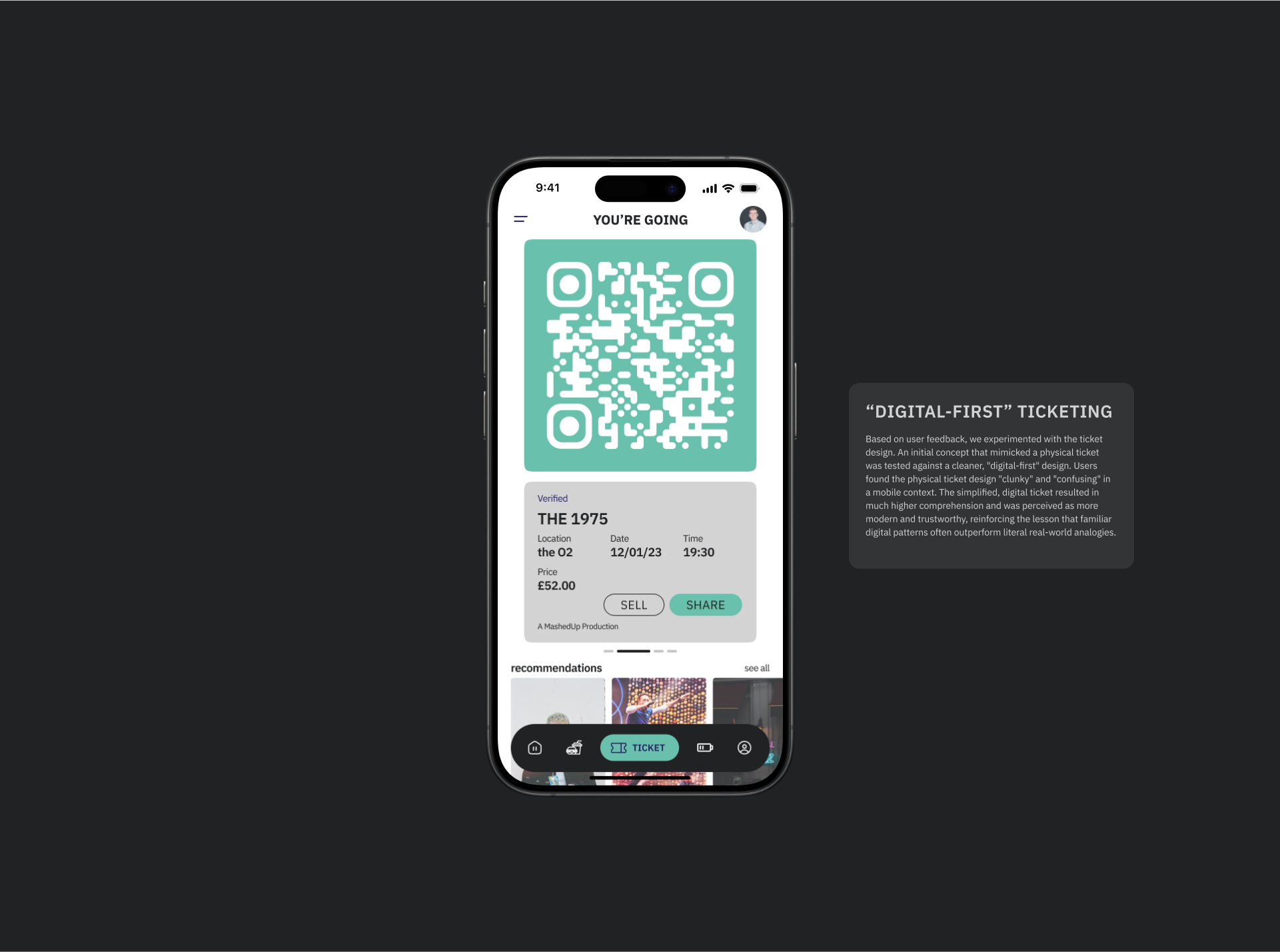
Experimentation

Lessons learnt
As my first freelance project working on a live product, The UP Co. was a valuable lesson in adapting to existing technical constraints and managing client relationships. The challenge was to balance the client's vision with user needs and technical feasibility, all while delivering tangible improvements to a product already in the market.